# Guide
# Installation
npm install --save vue-colrow
# Import
import { Row, Col, BreakRow, config} from 'vue-colrow'
import 'vue-colrow/dist/vue-colrow.css'

// register as global components. also can be used as local components
Vue.component('Row', Row)
Vue.component('Col', Col)
Vue.component('BreakRow', BreakRow)

// set global config. default horizontal gutter(column spacing)
config.DEFAULT_GUTTER_X = 20
BreakRow is row breaking component. Config is a global configuration object, and its properties can be modified. Col, BreakRow must be placed in Row, a direct child of Row Can only be Col and BreakRow. The direct children of Col are your custom content, which can be Row. Nested Rows are independent of each other and do not communicate with each other.
<Row>
  <Col>your content</Col>
  <BreakRow />
</Row>
# col width
Col's prop width can pass in number, number greater than 1 is considered to be pixels of the specified length, number less than or equal to 1 is considered to be percentage, so 1 represents 100%. Its default is 1, representing full row width. You can pass in a non-number, this will directly pass to the css width, but in this case you need to adjust it yourself, this project does not deal with it.
# col grow
Col's prop grow can be boolean or number, which will be passed toflex-grow. If the width is not specified, the width will be set to 2 px, this is to prevent the column from growing to greater than the remaining space, otherwise it will display to the next row. The growth column takes up the remaining space in the row. If there are two growth columns in a row and the value of grow are equal, the remaining space is evenly divided. If you want a column taking up remaining space, another column display in next row, place <BreakRow /> after the Col to break row manually.
# gutter
Gutter is column spacing, there are gutterX(horizontal spacing), gutterY(vertical spacing). Row's prop gutter can pass numbers, arrays. Number is considered to horizontal spacing and vertical spacing. A number array of length 2 is considered horizontal spacing, vertical spacing. You can pass null. In : gutter =" [null, 20] ", null will take the default value in the global configuration(config.DEFAULT_GUTTER_X or DEFAULT_GUTTER_Y).
# Responsive
The default value if config.BREAK_POINTS
BREAK_POINTS: {
  xs: 544,
  sm: 768,
  md: 992,
  lg: 1200,
},
Row's prop breakPoints is equal to the global configuration config.BREAK_POINTS. Props with xs or xs prefix are only effective for screens smaller than xs, props with sm or sm prefix are effective for screens larger than xs, and so on. The responsive props for Row's gutter are: xsGutterX, xsGutterY, smGutterX, smGutterY, mdGutterX, mdGutterY, lgGutterX, lgGutterY, xlGutterX, xlGutterY
The responsive props for Col's width are: xs, sm, md, lg, xl. For grow: xsGrow, smGrow, mdGrow, lgGrow, xlGrow.
You can pass prop xs to make BreakRow only displaying when the screen is below xs, pass prop sm to make it displaying only when the screen is larger than xs and less than sm, and so on. Responsive props for BreakRow display: xs, sm, md, lg, xl
# css hack
# calculation accuracy
The calculation of CSS is different in different browsers. After calculating the width by percentage in some browsers, the child elements are actually a little wider than the parent element, which causes the last column to be displayed in the next row. For this situation, the width of each column be reduced (0.0npx). Because the new browser does not have this bug, so this is only enabled for browsers other than node, Chrome, Firefox, Safari. Global configuration config.COL_WIDTH_REDUCE and Col prop colWidthReduce configures the reduced width.
# overflow
In fact, the width and height of the Row child elements exceed that of the Row. Beyond a gap of gutter length, Row uses a negative margin to make the position of the subsequent element displayed correctly. When the Row width is close to the screen width, the Row child element exceed the screen , Resulting in a horizontal scroll bar. So overflow is used to hide the excess part.
# set row height by js
The height of the Row element is also exceeded. After using a negative margin, the subsequent elements can be displayed in the correct position. However, the excess is still displayed, and it cannot be hidden with overflow. So get the Row to the correct height through JS and set it to Row. It listens the window's resize event and use MutationObserver to monitor the DOM change, and refix the height when changing. You can turn this off through Row prop heightCalculation or global configuration config.ROW_HEIGHT_CALCULATION.
# DEMO
# Responsive Form
The figure below has a card with a fixed width on the left and the remaining width on the right. The form has multiple input boxes, which vary in width depending on the type. For the sake of intuition, the fraction is used to as the width of the column. On the other hand, for small screen, the input box is full width, use :xs ="1" to do that.
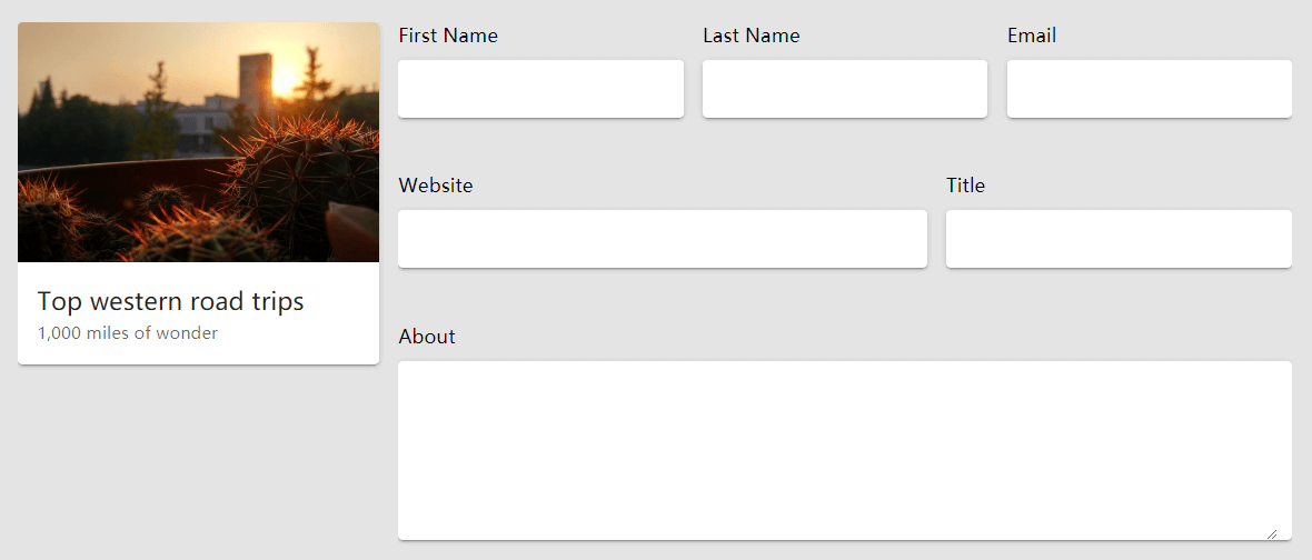
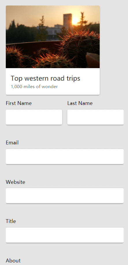
<Row>
  <Col :width="300"><Card1 /></Col>
  <Col grow :xs="1">
    <Row>
      <Col :width="1/3" :xs="1/2">
        <label>First Name</label><v-text-field solo></v-text-field>
      </Col>
      <Col :width="1/3" :xs="1/2">
        <label>Last Name</label><v-text-field solo></v-text-field>
      </Col>
      <Col :width="1/3" :xs="1">
        <label>Email</label><v-text-field solo></v-text-field>
      </Col>
      <Col :width="3/5" :xs="1">
        <label>Website</label><v-text-field solo></v-text-field>
      </Col>
      <Col :width="2/5" :xs="1">
        <label>Title</label><v-text-field solo></v-text-field>
      </Col>
      <Col>
        <label>About</label><v-textarea solo></v-textarea>
      </Col>
    </Row>
  </Col>
</Row>
# Card list
This is a common layout, n x n card list. In the past, we common used css float + margin to do, and we need to calculate the card width and accurately remove the margin of the last column. Through this project, directly use fraction to set card Col width. Use xs,sm, md and other responsive props we even can set the width of the card under different screens easilly.

<Row>
  <Col :xl="1/5" :lg="1/4" :md="1/3" :sm="1/2" :xs="1" v-for="i in 23" :key="i+'card'"><Card1 /></Col>
</Row>
# Import by script tag
Download the latest version from github or npm, impoty dist/vue-colrow.js or dist/vue-colrow.min.js, dist/vue-colrow.css. You can access the library through gloabl variable vueColrow.
<script src="yourpath/dist/vue-colrow.min.js" charset="utf-8"></script>
<link rel="stylesheet" href="yourpath/dist/vue-colrow.css">
<!-- usage -->
<script type="text/javascript">
  // register as global components
  Vue.component('row2', vueColrow.Row)
  Vue.component('col2', vueColrow.Col)
  Vue.component('br2', vueColrow.BreakRow)
</script>
API →